What Makes a Good Departure Board: Design Lessons from Train Stations
Physical departure boards in train stations are masterclasses in information design. Here's what makes them work—and how these principles should guide digital transit apps.
Walk into any major train station and you'll instinctively look up at the departure board. Within seconds, you can scan dozens of departures and find exactly what you need. No tutorial required, no learning curve—just immediate, actionable information.
This isn't accidental. Departure boards represent decades of refinement in displaying time-critical information to stressed, hurried people. Yet many digital transit apps ignore these hard-won design lessons.
The Anatomy of a Great Departure Board
Great departure boards share common characteristics, whether you're looking at the flip boards at Grand Central, the LED displays at King's Cross, or the modern screens at Britomart:
1. Scannable Information Hierarchy
The most important information (destination and departure time) is largest and most prominent. Secondary information (platform, calling points) is smaller but still clearly readable.
2. Consistent Layout
Every line follows the same format: Time | Destination | Platform | Status. Your eyes learn the pattern and can process information faster.
3. Clear Status Indicators
Delayed trains are immediately obvious through color coding, special text, or positioning. No ambiguity about service status.
4. Relevant Time Window
Shows the next 10-20 departures—enough context to make decisions, not so many that it becomes overwhelming.
Why Physical Boards Work So Well
Physical departure boards succeed because they're designed for a specific use case: helping people make quick decisions under time pressure. They optimize for:
- Speed of comprehension – Information is processed in seconds, not minutes
- Distance viewing – Readable from across a busy concourse
- Ambient awareness – You can monitor changes while doing other things
- Stress tolerance – Clear even when you're rushed or distracted
The Magic of "Glanceability"
A good departure board answers your question before you fully formulate it. You approach thinking "when's my train?" and the answer jumps out immediately. This is the gold standard for information design.
Where Digital Apps Go Wrong
Many digital transit apps break the principles that make physical boards successful:
❌ Information Overload
Apps cram in weather, news, ads, social features, and other distractions that compete with the essential departure information.
✅ Focused Information
Show departures prominently with minimal competing elements. Everything else is secondary.
❌ Inconsistent Layouts
Different screens show information in different formats, forcing users to relearn the interface each time.
✅ Predictable Structure
Use the same layout pattern across all screens so users can scan efficiently.
❌ Buried Status Information
Delays and disruptions hidden in sub-menus or shown with unclear iconography.
✅ Immediate Status Clarity
Make service issues immediately obvious through color, positioning, or clear language.
Typography and Readability
Physical departure boards teach important lessons about typography:
- High contrast – White text on black backgrounds or black text on bright yellow
- Sans-serif fonts – Clean, geometric typefaces that remain legible at various sizes
- Generous spacing – Enough white space to prevent visual crowding
- Consistent sizing – Clear hierarchy with no more than 3-4 text sizes
The classic "Dot Matrix" look of flip boards wasn't just aesthetic—it was optimized for rapid character recognition under various viewing conditions.
Color Psychology in Transit Design
Physical boards use color strategically:
- Green – Service running normally
- Yellow/Amber – Caution, minor delays
- Red – Problems, major delays, cancellations
- Blue – Information, special services
These aren't arbitrary choices—they leverage universal color associations and accommodate color vision differences.
The Context Problem
Physical boards have one major advantage: context. They're located where you need the information, surrounded by the relevant infrastructure (platforms, signs, announcements).
Digital apps must recreate this context through:
- Location awareness – Showing nearby stations prominently
- Personalization – Learning your regular routes and stations
- Quick access – Minimizing taps to reach essential information
Lessons for App Design
Applying departure board principles to digital transit apps means:
- Lead with departures – Make train times the primary interface element
- Maintain consistency – Use the same layout pattern everywhere
- Prioritize speed – Optimize for quick glances, not extended browsing
- Handle errors gracefully – When data is unavailable, communicate clearly
- Respect attention – Don't compete with essential information
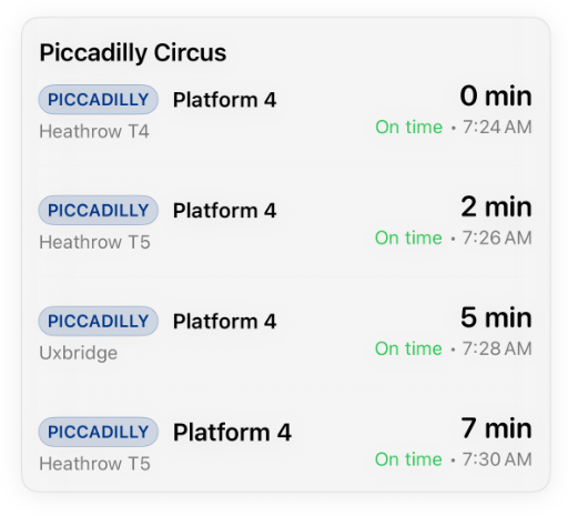
Clean departure board design in action: scannable layout, clear timing, consistent structure
Experience Departure Board Design Principles
See how traditional departure board design translates to modern transit apps.
7-day free trial • No ads • Privacy-focused
The Future of Departure Boards
Modern departure boards are evolving with better displays, real-time data, and smart features. But the core principles remain unchanged:
- Information must be immediately comprehensible
- Layout should be predictable and consistent
- Status must be unambiguous
- Design should serve the user's urgent need for information
The best digital transit apps don't try to reinvent these principles—they apply them thoughtfully to the constraints and opportunities of mobile devices.
Beyond the Board: Ambient Information
Physical departure boards excel at ambient information—you can monitor them peripherally while doing other things. Digital apps can capture some of this through:
- Widgets – Glanceable information on home screens
- Watch complications – Next departure always visible
- Lock screen integration – Information without unlocking
- Smart notifications – Proactive alerts about disruptions
The goal is information that's present when you need it, invisible when you don't.
Great departure board design isn't about flashy features or clever interactions—it's about respecting the user's context and delivering essential information as efficiently as possible.